Getting Started / Tutorial for Newbies
This tutorial should help users to get prepared for their first design. To avoid getting confused with advanced features it is recommended to use the LayoutEditor in the Basic Mode. This mode can be setup via the setup dialog.
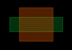
The first Steps: Creating Boxes
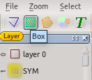
The drawing part can be in different states called modes. The current mode is displayed with a yellow background in the tool bar. |
|
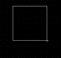
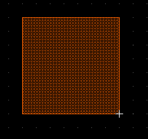
Enter the first corner of the box: Make a left click with the mouse into the drawing area. |
|
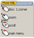
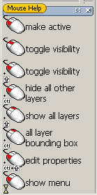
The function of the mouse depends on the mouse location, key modifiers and the drawing mode. The mouse help sub windows in the lower left always show the occupation of the mouse buttons. |
|
A second left mouse click will complete the box. |
|
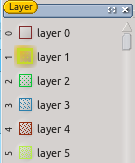
For designing a layout it is not enough to define the shape. Also it must be clear what to do with the shape. It can represent a conductor, a donated area, seismic mass of a sensor, ... The assignment of a shape to a technology function is done via layers. Each shape is assigned to a layer. A layer can ether represent a technology function or a logical function like labeling. If you want to use an existing technology, there are normally fixed rules on which layer to place the shapes.To enable proper differentiation of the layers they are painted in different colors and different fill styles. Layers with similar function may get similar colors. In the LayoutEditor there is a dock window with all available layers. One layer is always marked with a special background. This is a active layer. New shapes will always be added to the active layer. |
|
Activate an other layer via the layer toolbar by a left mouse click. Draw an other box. |
|
Design can get huge and rich in detail. So a efficient zooming and scrolling functions are essential to be productive. The LayoutEditor has a variety of features in this area. The most common zooming and scroll handling is done directly with the mouse. You can zoom with the mouse wheel and scrolling by holden down the right mouse button. |
|
Alternative:
- There are tool buttons for scroll/zoom.
- Scrolling/zooming can be done via the menu (zoom). The menu can be reached via the menubar or via a right click on the mouse in the drawing area.
- Use the hotkeys: cursor for scrolling, + - for zoom.
Other Shapes
Beside the box elements there are three other basic shapes: polygon, path and text elements. |
|
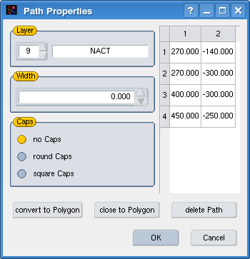
Activate the Path Mode via the toolbar and add a path. |
|
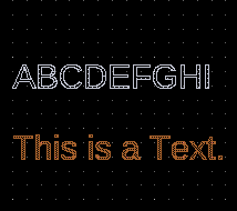
Text elements are also drawn with a default size and a default alignment. This properties can be adjusted in the same way via the properties dialog as any other element. Text elements are not well standardize and may be displayed different with other software and not all properties can be saved in all supported file format. Even text elements are ignored by many photo mask production systems. If you want get sure that the text element appears on the mask in the same way as on the screen, you can convert the text element to polygons. This can as well be done via the properties dialog with a tool icon in the lower left. |
|
Hierarchical Layout
Most design have many repeating structures. In principal it is possible to copy repeating structures as often as required, but this is inefficient in two ways: First it requires unnecessary memory. Design can be quit complex and a file size of some GB are not unusual for a little bit more complex ICs. So the hardware requirements will increase and the performance will be reduced. The second problem is, if you want to change a repeating structure, you had to do this multiply times. With hierarchical layouts you can avoid this two problems. Repeating structures will only be drawn once and in the main design only a reference to this structure will be insert. Hierarchical layouts are very common for IC design and is well supported in the LayoutEditor.
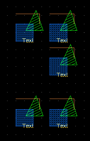
Add a new cell to you design |
|
The hierarchy is not limited to one level. Five or more level are standard in many design. There is no limit in the number of levels. |
|
Modify Designs
Beside the Properties Mode to edit elements in a dialog there are a plenty to possibilities to modify the elements in a graphical way. Requirement for any graphical editing is an exact selection. To make a selection/deselection there are 6 different function available: Form Select Mode( |
|
Select all elements of your cell |
|
Rotate it |
|
Deselect the right part of the design |
|
Move the left part of the design left |
|
In this example only the half of the points of the middle element are selected. With the move the middle element will be stretched.
Other useful modify functions are:
Units

The absolute and relative to the last point position of the mouse is displayed in the position status bar in the lower left of the LayoutEditor. By default after starting a new design all display sizes are in µm. The smallest possible resolution is by default 1nm. These values will be save with the GDSII file format which is the standard file format in the LayoutEditor and it is standard in the MEMS/IC industry. A adjustment of the userunits and database units is possible via SetupDialog.


 via the toolbar 'Displayed Cell', and add an additional box. Switch back to the previous cell